Creating The Most Flavorful Hospitality Experience in Guam
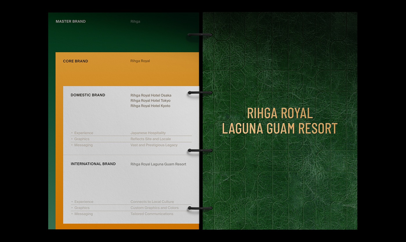
With a celebrated history of 80 years and a reputation for providing high-quality services, Rihga Royal Hotel Group is one of the top hotel chains in Japan. While the pandemic had a severe impact on the travel industry, Rihga Royal decided to expand its business to Guam, a globally popular resort destination, to be ready for the post-COVID era. The group acquired Sheraton Laguna Guam resort and collaborated with BAT to create a diverse brand experience, including brand strategy, visual identity, and brand application.
Tradition Meets Modernity
Before Rihga Royal's global expansion, BAT undertook research to understand the characteristics and market status of the Guam region. With the emergence of competitive resort cities, Asian tourists perceived Guam as an outdated resort destination. To address this market perception, a localization strategy that reflected sophisticated and modern changes and the unique characteristics of the new point was necessary. Therefore, BAT set the objective to maintain the unique heritage of Rihga Royal as a Japanese mainland brand while establishing an expanded identity through a harmonious blend of tradition and modernity.
New Expectations
The pandemic has brought about new expectations, resulting in a different perception towards travel and resorts. To understand this shift, BAT segmented potential customers and conducted FGI interviews. By analyzing the experience goals and lifestyles of Asian tourists, BAT discovered that travelers wanted a "comfortable and natural experience in a new space" where they could fully focus on themselves. Therefore, BAT's primary direction for the Rihga Royal Guam Resort was to create a "space where people can completely focus on themselves," rather than the typical glamorous and dynamic image of tropical resorts.

Sophisticated SImplicity
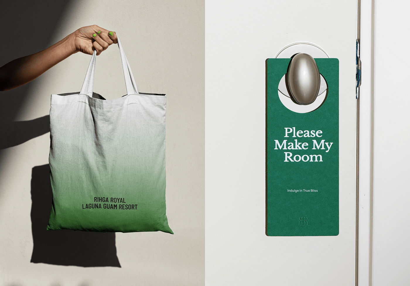
To differentiate the Rihga Royal Guam Resort from other competing brands in the Guam region, BAT redefined the value that the space pursued. Rather than conveying a similar mood and standardized brand experience elements and content, the resort's visual direction started with the vibrant natural landscape and the flow of time, which provided a "natural comfort." The set color scheme removed excess to create a modern and sophisticated atmosphere, and the typography was designed to reflect Rihga Royal's heritage while being modernized.


Sophisticated SImplicity
The visual identity of the Rihga Royal Guam Resort achieves a harmonious blend of tradition and modernity, providing visual enjoyment to an expanded target audience. The mint and orange colors added to the existing color system convey a lively mood and, in harmony with the main color green, produce a young and exciting brand image. In addition, the pattern combining linear elements and sans-serif typography with the classic existing logo is used as a key identity element, and the revamped typography system completes an organic brand identity through the balance between serif and sans-serif fonts.


Sophisticated SImplicity
BAT placed significant emphasis on the convenience of system use when developing the identity of this project. Friendly and specific guidelines for each visual element, such as color, typography, and layout, were provided to enable anyone involved to apply them easily. Moreover, art direction guides for brand image and video were developed to ensure that the modern and comfortable image of Rihga Royal is consistently communicated across various customer touchpoints such as websites and social media.


